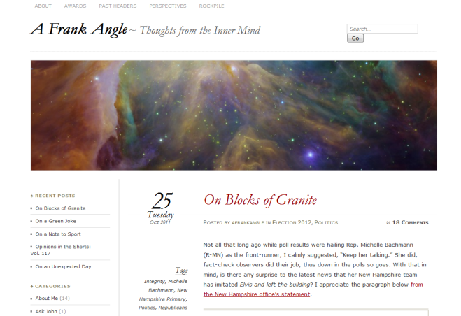
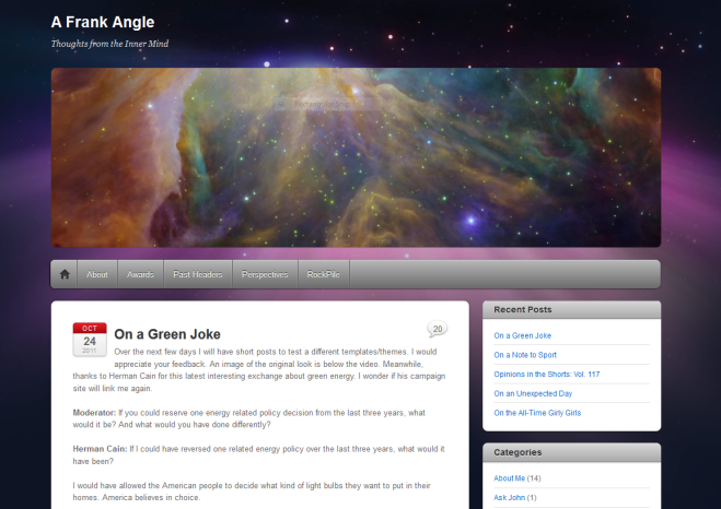
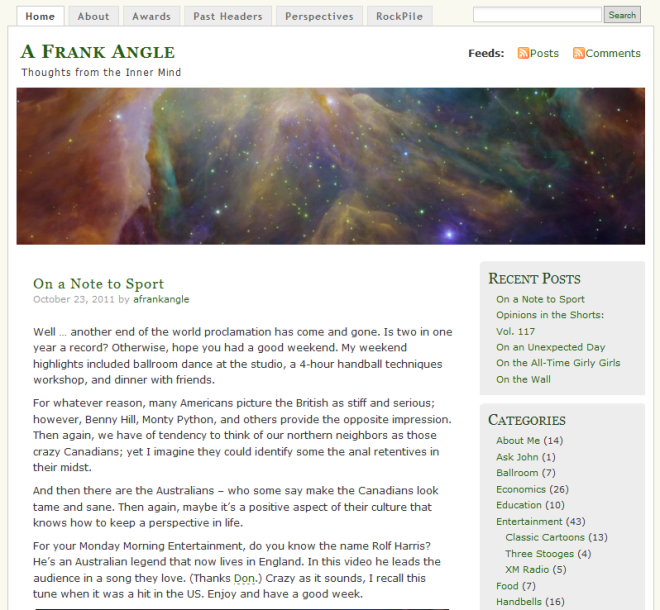
This is the last day in the series of different themes/layouts that I’m considering. I appreciate the feedback and included images of the others below the post (including the original).
Not all that long ago, George Clooney decided to film a movie from the site of his roots: Cincinnati. Ever since the filming, the area has been anticipating its release. Last weekend we saw Ides of March, billed as a political thriller about a Democratic candidate in the Ohio Primary.
A few days after seeing the film, a Letter to the Editor appeared proclaiming the movie as nothing more than political propaganda for the Democratic Party, thus left the movie and sought his money back.
Although George Clooney movies generally have a political edge, Ides of March can’t be near any Michael Moore movie, Citizen United’s Hillary: The Movie, or even Sarah Palin’s self-promotional endeavor, The Undefeated.
I provide some recommendations for those considering Ides of March.
- If you are concerned about this movie being a propaganda prop, don’t go!
- If you can look at the movie’s twisted view of the political arena, go!
- If you can enjoy it as a movie with a story, go!
- If you enjoy close-up views of Clooney and Ryan Gosling, go for your eye candy!
To me, the movie was OK, but could not give it a 10, an A, or whatever top rating. Sure, I was interested in seeing the Cincinnati scenes and keeping a watchful eye for two extras that I know. Nonetheless, it was entertaining – although the credits state, “Filmed on location in Michigan.”
Sample 1 (iTheme2)
Original (MistyLook)


Sample 1 here is okay, but I’m still gonna vote retro.
Try “Primary Colors” with John Travolta. While many decry it as a hatchet job on Bill Clinton, I found it an interesting “power politics” story (with obvious generous nods to Billy boy). I’ll catch this one when it hits cable, and let you know then (if I remember) what I thought of it.
Hope you had a happy hump day!
LikeLike
John,
I didn’t see Primary Colors, but will keep it in mind. Heck, it’s long enough ago that the library may have it. Ides is descent, but I didn’t find it to be great. I guess George got some ideas from his dad who had an unsuccessful 2004 bid for Congress. Thanks for commenting.
LikeLike
i never go to the movies, so i’ll have to wait until the movie is on cable. i don’ t like this theme at all, frank. the green on the side is just icky. i still like the original best followed by sample 1.
LikeLike
Nonnie,
I know what you mean about the green. With each theme I went with the default settings. I just looked and found that the green is changeable … so it’s now gray. Still, the green was an odd default. I appreciate your eye, so many thanks.
LikeLike
I gotta disagree, John! I’m still voting Sample 1.
LikeLike
Scott,
Beware of disagreeing with John b/c Blackjack could come into play. Thanks for your input on the theme.
LikeLike
Blackjack? Eek! Sounds ominous.
LikeLike
Hey Scott,
Look at John’s avitar pic, but I won’t tell you which one is Blackjack.
LikeLike
Don’t worry, Scott, I’d never sic Blackjack on you just for disagreeing with me. I save him for more important tasks. 😉
LikeLike
John,
Here’s someone with a warped sense of humor … Visit Les at bestbathroombooks.wordpress.com … of course tell him I sent you.
LikeLike
I love the “purple” theme, however it’s the content of your blog that keeps me looking/reading here and not so much the appearance.
Have a great week, my Ohioan friend!
LikeLike
Meesh,
Many thanks for the input. I wanted to test the waters and get some outside input … thus returning to the original tonight. So who knows if I’ll change in the future. Besides, WordPress offers new themes every so often. Yet, I appreciate your words regarding content vs appearance. Wow … that can be applied in so many ways.
Have a great rest of the week and weekend ahead. Thanks for visiting and commenting.
LikeLike
“eye candy” how many calories would you say that has? Sample 2 is my favorite. I like the blog heading and post title font and size as well as the date, but I’m not opposed to any of the others.
LikeLike
Rita,
Eye candy has no calories, and could even be considered as a calorie reducer. I’ve actually never heard that term before, but got it on another post.
Thanks for the input. Interestingly, not many positives for the one this last one, which is fine as it is my least fav. I’ll go back to the original design within the hour, then maybe make a change in the future. I appreciate the feedback and thanks for visiting.
LikeLike
It seems my tastes are still the same in that I like the simplicity/cleanness of Sample 2, and the way your header blends with Sample 1. I don’t care much for MistyLook, maybe because it was a theme I used sometime in the past and grew tired of looking at (which is why I redecorate occasionally). If I had to pick one of the two I like, I’d go with Sample 2 because it allows the light and colors in your header to stand out and on their own (rather than blending as they do in Sample 1, which is not a bad look either — it really all depends on what YOU are looking for).
The movie sounds interesting. I’ll add it to my list of movies I’d like to see. Thanks! 🙂
LikeLike
Robin,
Thanks for the excellent feedback. I’ll may change sometime, but not just yet – but I was just getting some feedback. Thanks for visiting.
LikeLike